October 2021 – December 2021 (2.5 months)
Academic Group Project.
Role: UX Researcher and Designer, Product Strategy.
Enhancing the overall user experience of a typical city hall visitor and connecting them to city government resources at the largest city hall of the States.
Introduction
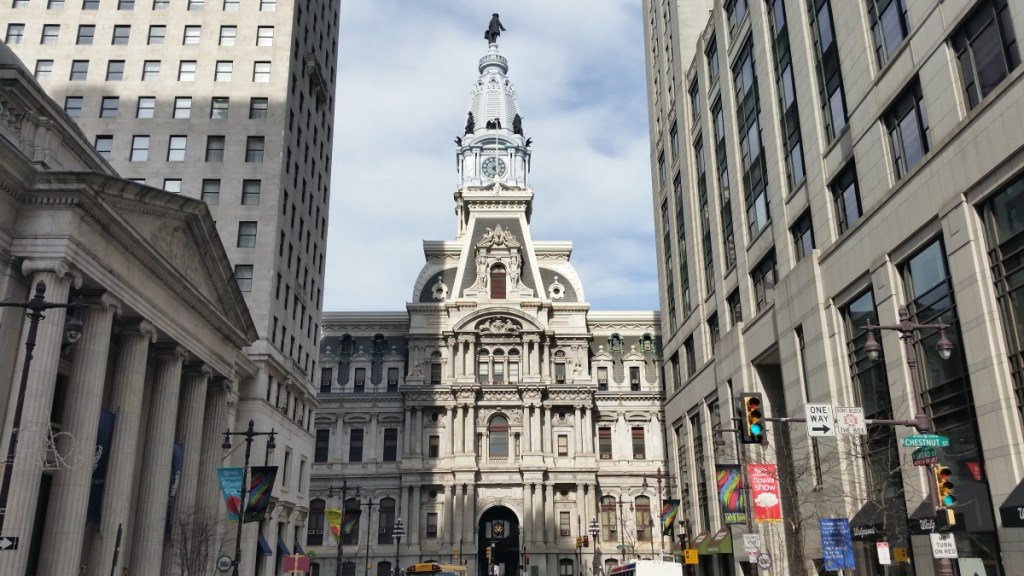
Client: Philadelphia City Hall

City Hall in Philadelphia is the largest city hall of the United States. It is located in the heart of the city and offers many public services to Philadelphians. Along with that it is a tourist destination, a transportation hub, and provide public space for many activities right in the heart the downtown. I worked in a group of four people where we wanted to enhance the user experience of visitors coming to city hall for various services and help them navigate the space in and around city hall.
Problem Statement
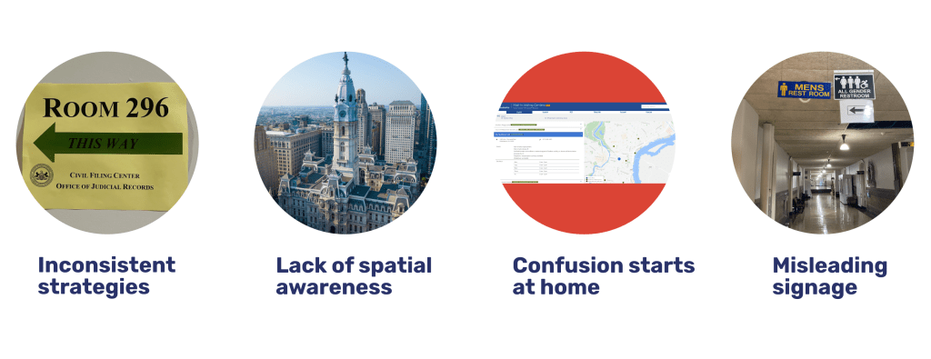
Due to the historical nature of the building design, high level of pedestrian traffic through the space, and lack of clear, consistent and coherent wayfinding strategies it can be difficult for both visitors and locals to navigate through the space. Unfortunately due to the size and space of the city hall visitors often get lost and rely on city hall employees for directions. Our design problem was to help city hall visitors navigate in and around the space at city hall.
Solution
Taking into consideration the needs of the drastically diverse population including and not limiting to digital literacy, language, age, disabilities and the levels of complexity for navigating in and around city hall we provided a suite of physical and digital solutions that work best when implemented in conjunction with each other. The temporal and spatial impact of the solution in the user’s journey is mentioned below.
Design Process
Research
Client and Stakeholder Interviews
We conducted 25+ plus interviews with City Hall employees and visitors to understand how they find their way to various services and offices in the City Hall. We wanted to understand how and where people get lost, when they need help, why they end up in the wrong location, how and how much do the current strategies guide them.
Shadowing
Our aim was to observe as much as we can. It was crucial to record exactly what people coming to city hall do and we used the immersion technique of shadowing people. We observed around 5 couples coming to get their marriage license at the marriage license office at City Hall. Our focus was to pay close attention to the people’s interaction with the surrounding.
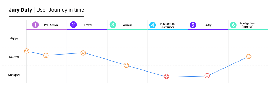
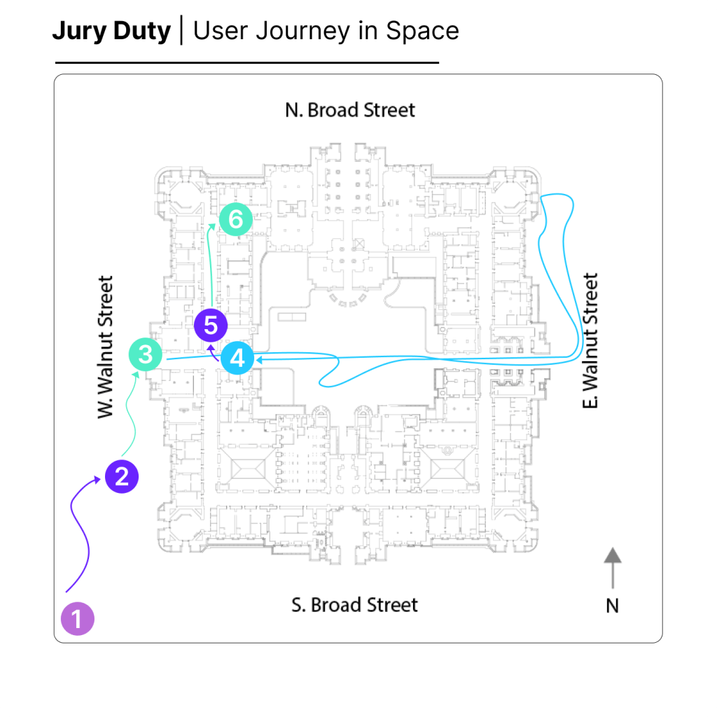
We mapped the typical user journey starting at home and ending at a city hall office across time and space. This helped us understand the user’s perspective, visualize patterns and unpack some context of the pain points that we were dealing with. Here we have mapped a typical juror’s journey to the jury duty office at City Hall.
Identification of Pain Points
We then clustered our findings in to common themes. This enabled us to identify the core pain points that visitors have when visiting city hall. The top identified pain points are
Evaluating Impact vs Feasibility of Pain Points
While being conscious of our constraints when it came to funding, resources and time we wanted to prioritize the pain points to identify what will really work and what will have the most impact. For this we came up with ‘How might we’ for all the identified pain points and then worked with our client to further evaluate the feasibility and impact. The matrix shown here evaluates the different levels of impact and feasibility of ‘ How might we…’ for all the pain points we identified. While working with our client, we chose the following three how might we statements in our design process.

How Might We…

Ideation
During Ideation our team brainstormed a lot of quick low fidelity ideas through Crazy 8 exercise. These exercise helped us cover a lot of pain points that we observed. During this process we also referred to Rose-Bud-Thorn activity to reflect upon solutions and in turn gain even deeper understanding of our the pain points.
We also came up with few design criteria to guide our concept selection process.

Prototyping
Considering the needs of the diverse population we wanted to prototype multiple solutions that will would potentially augment each other. We wanted to test the efficacy of these prototypes, population’s willingness to adoption of these prototypes, spatial and time impact of the prototypes, etc. The prototypes we tested are

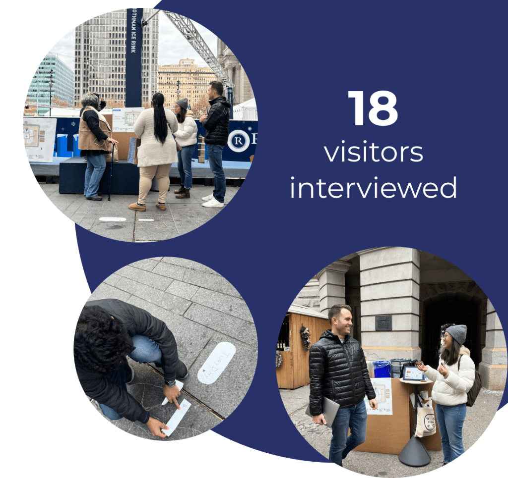
User Testing
During our first user testing session was a hypothesis-driven testing session. We wanted to test our assumption. We wanted to know if the prototypes provided the assumed efficacy. We wanted to prove/disprove our assumptions about the impact of the solutions, what people would prefer, whether right solutions are accessible to the visitors at right locations, whether people are able to comprehend the information which the prototypes are contain.
Solution Favorability
The following image shows the data of how people ranked the prototypes we had offered. Also, the preferences mentioned few intersections of favorability i.e few people ranked the two solutions at same rank. The following data is not only mentioned on explicit ranking but also on oral survey and general opinion of people.

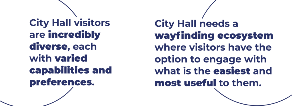
We learned that with our problem of way-finding, there’s no ‘one size fits all’ solution, this takeaway confirmed our hypothesis that visitors would benefit the most from a way-finding ecosystem where they can choose what’s easiest and most useful for them to engage with at any given time or location.

Usability testing
For our second testing session we were more focused while presenting our refined solution set to jurors as they were important for our case. We collected feedback on how we could improve the prototypes and verified that these solutions would empower them to navigate city hall confidently. As designer we were focused on
Learnings from User Testing – Product Strategy
Iteration after User Testing
We incorporated the feedback received from user testing and updated our prototypes accordingly when building high fidelity prototypes. The final solutions we developed are a result of designing with the people at city hall. The images shown below are for the solutions that I personally developed
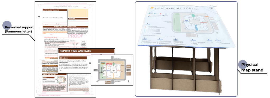
Physical Maps
The purpose of the map is to provide a general high level overview of the city hall building and the space around it. Its helps people orientate and guides them in external navigation. The maps will be placed at the fours corner of city hall, four portals(where most visitors tend to go when they can’t find the correct entrance and in the courtyard as it serves a crucial intersection and a decision making point.

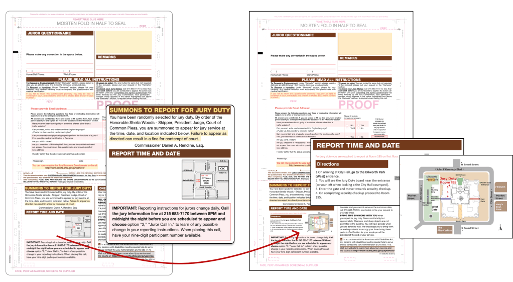
Prearrival Navigation Support
Providing visitors with important navigation information through various mediums such as emails, letters, and phone calls before their arrival at City Hall. Equipped with information before they leave their house, visitors are set up for success and will be less likely to get lost when they arrive.
This solutions addressed one of the more unique pain points – that jurors and visitors got lost starting at home. In our case here we solved for this by designing a new jurors summons that comes in various mediums including mail, email and phone. Notably, this solution can be leveraged for other similar offices and services.
Impact of Solutions
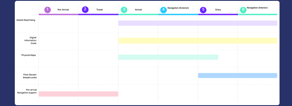
Temporal Impact
We analyzed how our solutions come to play in a particular time in the User’s Journey and the space around the city hall. Our solutions provide guidance to the users throughout their journey which starts at their home till they have reached the concerned office at the city hall. So, at any point in the journey they have accessible solution at their disposal.
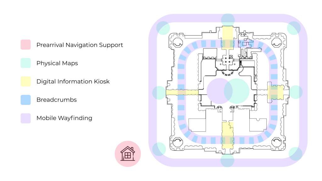
Spatial Impact
The image here shows how the solutions are applicable in and around the space of the city hall.
The solutions cover all the spaces where we found people usually get lost and end up looking for help. It can be seen here that the solutions like the map shown in green provides general high-level overview of the city hall space helps people in the external space of city hall, whereas once inside the breadcrumbs take over shown in blue and work best for internal navigation. So all solutions work best when deployed in conjunction with each other.
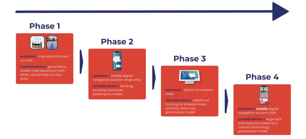
Next Steps
We presented our solution set to the Philadelphia Commissioner of Public Spaces and is accepted and is being proposed for funding. As a part of the hand off process, the next steps as well as a phased implementation plan as shown below.